
Since I arrived in Michigan, I have been using "The Journey is the Destination" notebook that was produced to celebrate BKxTSL Inspiration Lab. Every design opportunity we get at BK, our team pushes the boundary, and this notebook was no exception. Our concept for the notebook was straightforward.
If we were to design a notebook which TSL designers and craftsman can use in their everyday TSL moments, how would it look like and feel?
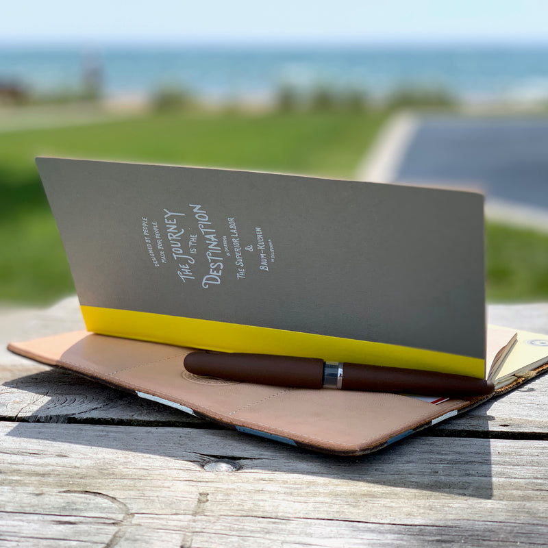
We designed the outside cover to be extra durable with an accent of yellow tape, which was also inspired by TSL signature paint style. Inside kraft paper was selected for utilitarian purpose with added white dots. Inside covers (both front and back) features Ame's sketches of BKxTSL collaboration artifacts.
Even though our concept was simple, the printing execution was quite involved between Frido and our local printer. The small details, such as the opacity of white prints on the outside gray cover required us multiple test prints.
Well, I am so glad that we poured a lot of love and energy into the design because all the details do make a big difference. One of my favorite aspects is white dots on the page. These white dots are so light, I barely see them. But it gives me just enough guidance to write straight and helps me utilize the maximum amount of page space when I write a lot on a spread. My pages look organized and easy to read back, without feeling constrained. I hope you enjoy it too:)
