

When I close my eyes these days, I see letters. Random combinations of letters. The space between them. Seemingly nonsensical phrases like “HAMBURGEVONS” and “HAHHAAOHAOOAO”. No, I’m not going insane…not just, anyway. I’m working on making my handwriting into a font in order to letter my comic. The bulk of the process is digital, but for the design decisions, I found myself seeking answers from analog: sifting through filled-up TN inserts, scribbling down bits of dialogue with a pen. Therefore I hope this will still be of interest to the community! Also, maybe if I talk about this here, I’ll stop kerning in my sleep. (Free me.)
In brief, comic book lettering is its own art form, separate from the script and drawings even as it helps bring the two together. It helps communicate the content and pacing of the writing and suits the art style, keeping readers immersed in the story. When you think of how quickly you turn a comic book’s pages, it might be understood why lettering is sometimes called invisible. And yet, ill-considered, it can make the reading experience distracted—or, at worst, downright illegible. This haunted my thoughts as I was deciding how to letter my own book. Fully hand-lettering hundreds of pages like the old pros was off the table; I struggle with managing recurring wrist pain as it is. However, my editor was strongly attached to my handwriting because it meshes so well with the traditional ink drawings. We compromised: I’d aim to create a font that imitated the look of my handwriting. I’m not a professional letterer, so I studied the work of those who are—industry pros from history and working now, as well as many a Youtube tutorial from graphic designers. Their knowledge helped me understand best practices and methods. But for core questions—What is the aesthetic approach for this font? What makes my handwriting mine, anyway?—I went back to basics, and cracked open my copy book.
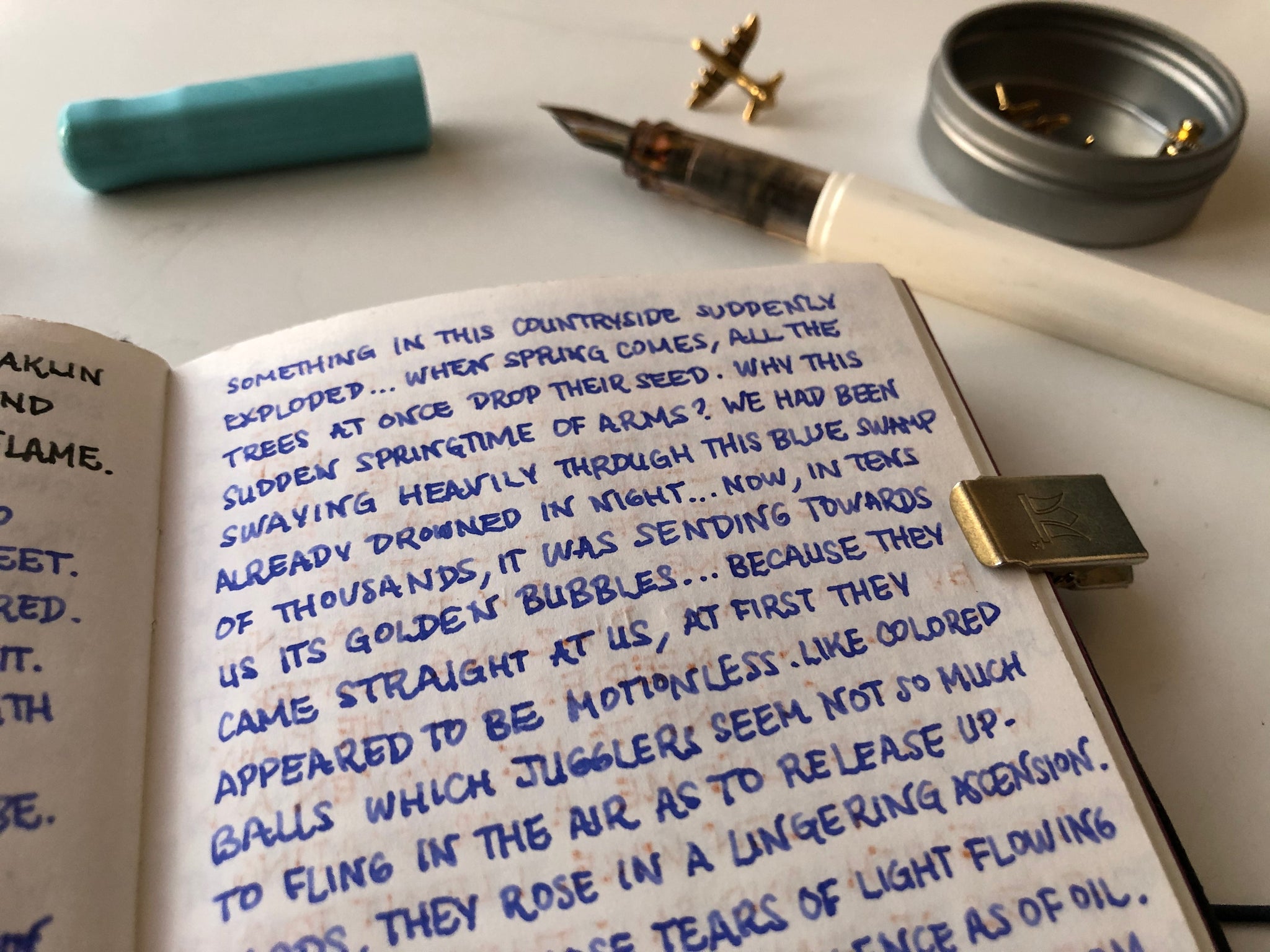
This is a blank passport TN insert I kept from 2018-2019 to jot down quotes and poems. It was also a way to try out different pens and ink colors without committing a whole planner spread. Compared to my everyday notes, the writing inside the copy book is more deliberate and elaborate, maybe because the words came from elsewhere. While copying, I could focus and enjoy each stroke of the pen while leaving my brain on autopilot.


If you’ve ever read and re-read a letter from a friend, or maybe pored over the wrinkled papers of your parents, grandparents or ancestors, you know how personal handwriting can be. Just as intimate as the meaning of your loved one’s words, the letterforms themselves have individual personalities and relationships to each other as they combine and flow together. But my own handwriting, while an essential part of me, isn’t something I think too hard about for its own sake. It’s like thinking about your nose. So upon closer inspection, there were some surprises. For one thing, the copy book was less consistent than I’d thought: I’d naturally varied my handwriting depending on the tone of what I was copying. Tight spacing and unadorned serifs for a terse, brutal poem by Rita Dove. Curly and elaborate letters twisting together for paragraphs from Antoine de Saint-Exupery’s memoirs. And what was with these design choices? I knew I never dot my i’s, but when and why did I start writing Z’s all wiggly like that? Who knows. If there are any answers to these questions, they’re buried in time and the subconscious.


I held these quirks and mysteries in my head as I took specimens of my handwriting onto the computer as a reference for digital typography process—an old frenemy. A decade ago, I went to a design school that drilled minimalism, symmetry, and precision into our heads as the gold standard for everything: design, type, even worldview. There was a logical kind of beauty in the philosophy, to be sure, but there was also rigidity, sterility and a lack of individualism. Which is why I left. Some of what I learned back then, I still find useful, such as the attentiveness-bordering-on-obsession that’s making me literally have dreams about kerning. Others lessons, I throw out the window. Because I’m in a place where I can determine my own goals for design and type for any given project. And in this case, the end goal isn’t a perfectly harmonious, clean-cut font. It’s a string of inconsistencies built up into an organic consistency, granting vibrancy and character to words and art together on the printed page. Hopefully.
In the font creation program I’m using, the letters (technically glyphs) you bring in are organized into rows of squares. Of course, it’s meant to evoke the type cases of yesteryear’s letterpresses. To me, especially if you use the color-coding feature, it also looks like the periodic table of elements. How fitting, for a process that’s part of the alchemy of transforming words, binding them to images, blending and balancing spontaneity with structure. Making this font has been slow and patient work, made slower by my inexperience and general lack of patience. But I’m grateful to have this task, because I’m not ready to say goodbye to my book just yet. I continue to tinker away, teaching it how to carry words. Along the way, I guess I’m learning to pay better attention how words carry themselves, too. It’s interesting, and easy. There’s no need for design training or an artistic eye. Take a look at your treasured postcards, letters and journal entries. Even the dashed-off grocery list on the fridge. If you squint, you might see it—all your years of writing, recording and experiencing, nestled quiet and not-quite invisible, between the tomatoes and the milk.


—
Alternate titles for this story that were rejected (by me):
Feeling Some Type of Way
Think of Me Font-ly
Text and photos by: A.C. Esguerra
Where to find A.C. : instagram @blueludebar
BK Artifacts mentioned or featured in the story:
- Traveler's Notebook / Black [Passport]
- TN Passport Refill / 003 / Blank
- TN / 030 / Brass Clip
- William Morris Pen Roll // Strawberry Thief
- BK x TSL Engineer Pouch w/Pockets || Kelp
Other Stories by A.C.: