

As a desert kid, I often wondered what it was like to experience autumn by a brisk wind under red leaves, or spring by a meadow bursting into bloom. Wistfulness is involved here because the climate I was accustomed to fluctuated between “oven”, “freezer” and “slightly nicer oven”. I was almost always sheltering from those extremes somewhere indoors and temperature-controlled, and didn’t rely on the unchanging landscape or the thermometer for awareness of the year’s progress.
What I did notice was how the pattern of sunlight falling on my desk would subtly change shape as summer wore on. How sunsets in clear November skies turn the mountains a deep, straight-out-of-the-crayon-box royal purple. Visual cues. Maybe that’s one explanation for why looking back through my journal’s spreads can be so deeply satisfying and anchoring. Now that it’s been almost a year since I started these daily drawings, I thought I’d share a closer look at how time’s showed up on paper so far.
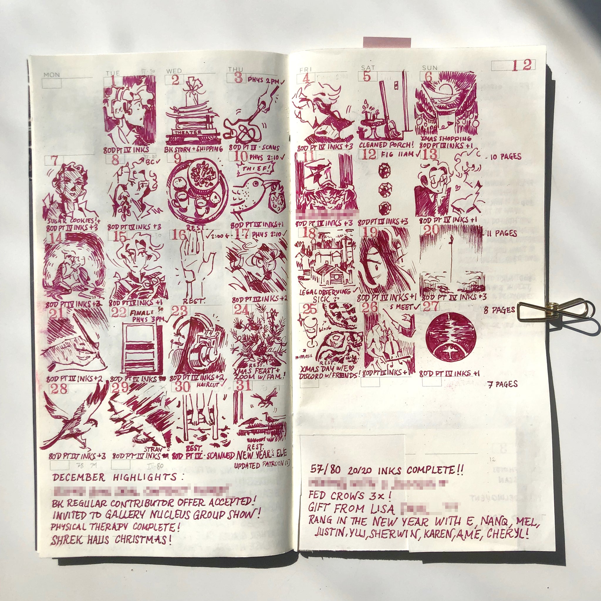
Generally, I choose a new color towards the end of the month. There’s no specific correlation between holidays and ink color. It’s all whim. I stick to a single color per spread because I’ve grown fond of the uniform look, but I do get restless in later weeks. If my fountain pen hasn’t run out of the current ink as the page turn approaches, I’ll make a large drawing or write a few pages elsewhere so it doesn’t go to waste. I remember doing this rather aggressively in February because the month was so short and I was excited to try a new ink sample. ”But A.C.,” you may ask, “why don’t you just get more fountain pens so you can load them up and switch between colors whenever?” That is a temptation for future me. (I’m saving up.)
In a previous JIYU story, I talked a little bit about keeping these daily doodles simple and focused. This reduces the pressure to make a “good” drawing in such a small space, which probably helped build the habit at the beginning. However, I’m not a minimalist by nature. As I got more comfortable, the compositions got more cluttered, occasionally filling squares edge to edge. Maybe you can see what I mean by looking at the March and April spreads. There’s a big jump in line quality. Two reasons for this: first, during that time I did get a new pen with a finer nib, allowing me to make thinner and more sensitive marks. Second, I had more time and mental clarity to journal and draw for fun by then—I was finally coming down from a heightened, feverish state of weathering life events, both good and bad.


I started doing these calendar drawings in August 2020 to combat the weird memory loss that comes with stress. I was trying to hold onto details, to fish out the good things from a blurred and constant stream of anxiety. It definitely helped. There are a lot of things I’m sure would’ve been forgotten or diminished in my mind if I hadn’t set them down here. But now that some time’s passed and the urgency of recording has subsided, I don’t find myself looking too closely at each individual day. Just by glancing at the changing colors and density of the drawings, I can enjoy an overall snapshot of each month’s mood, tone, air.


Once I’ve filled up June, it’ll be time to start a new insert. I wonder how much longer I’ll keep up this habit, and how it might evolve. Maybe I’ll reintroduce bits of collage. Maybe I’ll let ink cross over into neighboring squares or spill out into the margins. Maybe I’ll be extra chaotic and use two (or more?!) colors a month. Whatever it looks like, I’ll keep gathering up these days, these little proofs of the permanent growing season we’re in.

Text and photos by: A.C. Esguerra
Where to find A.C. : instagram @blueludebar
Read other stories by A.C. : Here
Bk Artifacts Featured in the story:
- Traveler's Notebook / Camel
- [BK Notebook] JIYU Planner
- TN / 030 / Brass Clip - Airplane
- Safari Fountain Pen / White
List of ink colors featured:
- August: Pilot Iroshizuku - Tsukushi
- September: Pilot Iroshizuku - Kiri-same
- October: Irojiten - Yamabukiiro
- November: Irojiten - Hisoku
- December: Mix; Diamine - Oxblood + Pilot Iroshizuku - Cosumosu
- January: Organics Studio - Nitrogen
- February: Three Steamboats - Le Bayou Bleu
- March: Irojiten - Hisoku
- April: Sailor - 123
- May: Monteverde - California Teal
- June: A mix made by a friend. I believe Winsor & Newton’s Orange is part of it.